Why great books are made long before the “Publish” button
If your book looks “almost professional,” this guide is for you
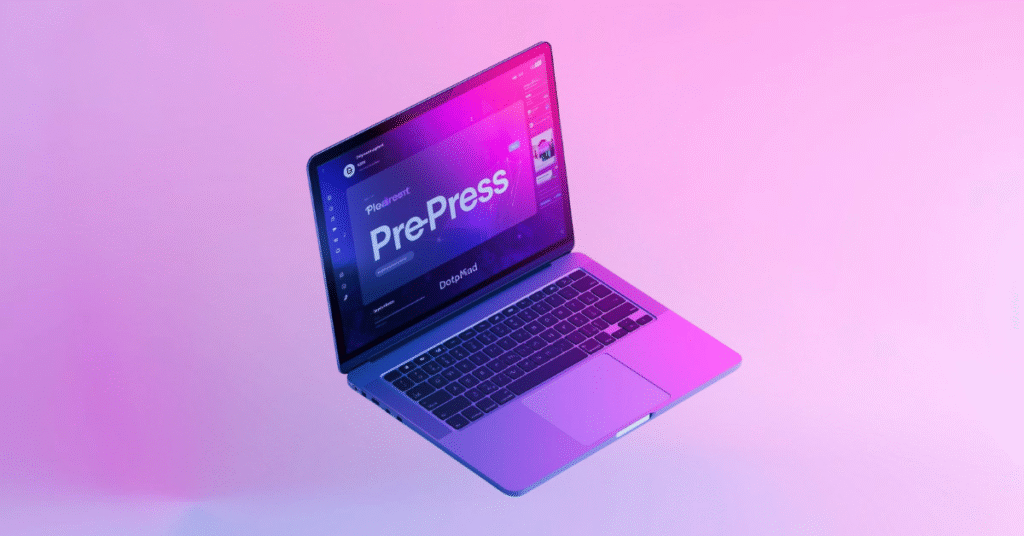
You’veIf you’re self-publishing a book, Pre-Press & Typesetting are the two most overlooked stages that decide whether your book looks amateur or professional. Even great content can fail if layout, spacing, fonts, and print preparation are handled incorrectly.
Margins look strange. Headings don’t align. Page breaks feel awkward. The PDF looks fine on your laptop—but wrong on print.
This is the silent struggle of self-publishing authors.
The problem usually isn’t your writing.
It’s Pre-Press and Typesetting.
In this guide, we’ll break down what professional pre-press really means, how typesetting impacts readability and credibility, and why skipping this stage costs authors sales, reviews, and long-term trust.
What is Pre-Press & Typesetting in Self-Publishing??
Pre-Press is everything that happens after editing and before printing or digital release.
It includes:
- Interior layout design
- Typesetting and text flow
- Font selection and hierarchy
- Image placement and resolution checks
- Trim size, margins, bleed, and gutter setup
- Print-ready and platform-ready file preparation
Think of pre-press as the engineering phase of your book.
If this step is weak, even the best content collapses under poor presentation.
Typesetting: the invisible craft readers instantly notice & Why Pre-Press & Typesetting Matter for Book Quality.
Typesetting is the art and science of arranging text so it’s:
- Easy to read
- Visually balanced
- Consistent across hundreds of pages
Good typesetting is invisible.
Bad typesetting is unforgettable.
Professional typesetting ensures:
- Proper line spacing and character tracking
- Clean paragraph flow without rivers or widows
- Logical heading hierarchy
- Comfortable reading rhythm across chapters
Readers may not know why your book feels premium—but typesetting is often the reason.
Tools authors use—and where most go wrong
LaTeX: precision for complex books
LaTeX is popular for academic, technical, and math-heavy books. It produces clean, structured layouts—but only if configured by someone who understands publishing standards, not just code.
InDesign: industry standard for layout
Adobe InDesign is the gold standard for professional book design. But owning the tool doesn’t equal mastering it. Most DIY layouts fail because of:
- Incorrect baseline grids
- Inconsistent styles
- Improper export settings
Word & DIY templates: fast, but risky
Templates may look fine initially, but they often break at scale—especially for print-on-demand platforms.
Professional pre-press means knowing when to use each tool—and how to prepare files correctly for the final output.
Print vs digital: why one file is never enough
A major self-publishing mistake is using one layout for everything.
Professional pre-press creates format-specific files:
- Print-ready PDFs (with bleed, CMYK, correct DPI)
- EPUBs with reflowable text and accessible structure
- Kindle-optimized layouts
- Accessible PDFs for screen readers and compliance
Each format has different technical rules. Ignoring this leads to rejected uploads, bad reviews, or accessibility issues.
Why professional Pre-Press directly impacts sales
Here’s what we see consistently across publishers and authors:
- Professionally typeset books receive higher reader retention
- Clean layouts reduce eye fatigue → longer reading sessions
- Better formatting leads to fewer negative reviews
- Retailers are less likely to flag or reject files
- Your book looks credible next to traditionally published titles
In short: presentation protects your content investment.
Common Pre-Press mistakes we fix every week
- Inconsistent fonts and spacing
- Chapter titles drifting across pages
- Images printed blurry or too dark
- Incorrect trim size and margins
- Broken EPUB navigation
- PDFs that fail accessibility checks
These are not “small issues.”
They define how readers experience your work.
Who needs professional Pre-Press the most?
This matters deeply if you are:
- A self-publishing author building a long-term brand
- A publisher scaling multiple titles
- An educational institute distributing learning material
- A channel partner producing whitepapers or manuals
If your content represents expertise, your layout must reflect it.
Your book deserves a professional finish
Writing gets the credit.
Design gets the trust.
Pre-Press and Typesetting deliver the experience.
If you want your book to:
- Compete with traditionally published titles
- Work flawlessly across print and digital
- Feel polished, credible, and reader-first
Then professional pre-press isn’t optional—it’s essential.
Ready to elevate your book from “published” to “professional”?
We specialize in end-to-end Pre-Press and Typesetting for authors, publishers, and institutions—ensuring your content is not just readable, but remarkable.
👉 Get your manuscript professionally prepped and publication-ready.
Because great content deserves an equally great presentation.